Designing for the B2B Buyer’s Journey

Each stage of the B2B buyer’s journey comes with a set of recommended collateral that has proven to meet and fulfill the needs of prospective customers in each phase. For example, HubSpot states that eBooks are best suited for the Awareness Stage, while case studies and data sheets best serve those in the Evaluation, or Consideration stage.
These marketing assets serve the informational needs of consumers and lay out the path to conversion. They are essential to guiding prospects through the research and securement of the perfect product or service for their company to solve their business problems.
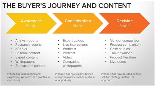
Above is HubSpot's recommendations for which type of content should be distributed in each phase of the buyer's journey. Image credit: HubSpot
Just as equally important as distributing the right collateral at the right time is the design of these assets. Design holds a lot of influence power, and if done right, can increase the success of your funnel-oriented content marketing strategy.
As a UX designer for our tech marketing agency’s clients, I’ve been involved in the creation of various marketing projects for each stage, and I can tell you from experience, conveying a message that gets results relies heavily on the color, imagery, and font you choose for design.
Branding Consistency in B2B Marketing Content
When you’re taking a prospect through the buyer’s journey, the most important task to carry out is consistency. All of the collateral — from top, middle, and bottom — needs to reflect a similar style that consumers can use as visual cues to ensure they are continuing down the same path they started.
For example, if you create a landing page for a checklist (basic interactive on-page SEO checklist), it must be stylistically consistent with the actual checklist design. If I have design influence over everything that the buyer is going to see for a client’s workflow, I strive for consistency in these areas:
- Color
- Font
- Font treatment
- Imagery
- Brand logos
While all the pieces of collateral serve a different purpose, consistency is key. When a prospective client is being introduced and going through that funnel, seeing that consistency will not only keep them on task in their journey but also establishes a sense of professionalism that ultimately earns their trust.
Designing for Awareness Stage
In this stage, the B2B buyer knows that they have a problem, but they’re unable to pinpoint the root of the problem. For this stage, I try to keep it as simple as possible, making the information easy to find and easy to digest.
When a buyer is in this stage, where a piece of equipment has broken down or there is a service gap in their operations, they don’t want to necessarily climb through a complicated design or something that is complex. I try to keep it simple so this buyer can easily and quickly find the information that they need.
When I say simple, I mean that across the board. Having an image upfront that instills confidence is a must. For example, you can add a stock photo of a professional who is representative of your industry confidently carrying out your service or installing your product. Imagery is important, especially for a buyer who, at this point, is still unsure of what they need and what the outcome of their research will be.
 Above is a stock image of a helpdesk technician confidently carrying out her company's services. These types of images convey a sense of trust and security.
We, as people, have a visceral reaction to photography. And if photography and images aren’t in the realm of what that buyer was expecting, they could turn away, thinking that this product or service isn’t going to fulfill their needs.
Here is my mindset when designing collateral for the Awareness stage:
- Come up with imagery that would resonate with somebody looking for that particular service. Try not to be too clever in this stage by using imagery and slogans that have nothing to do with your service, but are meant to be more of an inside joke. People don’t stick around for you to be clever; they want to know more about you right away. Stick to what you do and how you can help them.
- Select images that convey empathy instead of urgency. Additionally, you don’t want to use imagery that causes prospects to panic. For one of our clients, we designed a workflow about a technology service they provide to aid the new remote workforce that resulted from the social distancing aspect of COVID-19. We didn’t use images that represented the pandemic or the virus. Instead, I used images that were more comforting, such as a woman working from home with her daughter on her lap. I used a softer approach instead of a more stressful message.
- Avoid any complicated-looking typefaces or something that is hard to read. Don’t use typeface that could interfere with or convolute the intake of your message, such as Old English lettering. If they can’t read it, they’ll turn away in frustration.
- Place that easy-to-read information, along with imagery, in an area where it’s visible. Give them the solution they’re looking for quickly by placing your message front and center. TSL recommends putting the most important text and imagery above the fold so it can be seen without scrolling.
- Exercise a high-contrast load using font (such as bold), size, and color. A perfect example would be the same principle as driving past a billboard. You want to give a picture of the product and present your slogan with the simplest message and with the best contrast of letters, such as white lettering on a black background, or vice versa. And you don’t want a message that is too convoluted. You don’t want drivers to pass by your billboard and miss your message. The internet is just like a billboard — you want to be as clear and concise as possible, as fast as possible. You only have a few seconds to capture a browser’s attention. And you don’t want them to have to think too hard.
Designing for Consideration Stage
This is what I feel, as a designer, is the most important stage. For this stage, you don’t have to be as simple as the Awareness Stage. You want to show more of your beneficence while also setting the scene for the next stage of a consumer's research path. Present your product or services information in such a way that they know this is where they want to go “because this company knows what they’re talking about.” Craft the design (communicating visual elements for B2B content design) around the idea that your company is a subject matter expert, as opposed to listing out your credentials or resume.
You can go longer and more in depth in this stage than the Awareness Stage because you have more to tell. In design, appeal to their curiosity and their idea of what they want to achieve. Keep them turning the page.
As a designer, there’s a few different ways you can execute that technique:
- Give the prospects a lot of information about your product, but in a visually appealing way. Use interactive features, such as elements that flip, graphics that move or come apart, and auto-scrolling instead of clicking. Make it so visually appealing and user-friendly that they want to explore your information, including extra bonus information that may not necessarily directly apply to the product or service they’re looking for, but is related in some way. Make the process so satisfying that they inadvertently soak up this extra info.
- Present the information in chunks of text instead of one continuous stream of copy. You’re dealing with a lot of information and copy here, and you can’t just write the information and all the talking points in one block of body text. It’s overwhelming, and nobody’s going to go through all of that.
- Inform the consumer without over-loading them. Striking that balance between the two is key. People just want to find their information, and you should give them a design and experience where it’s easy to find. Try to create something that has a lot of information in it but that also tells a story. Break that information up into digestible portions, whether with icons or imagery. People tend to really react to these types of tactics, when you give them time to digest information instead of having to trudge through blocks of copy. When you couple the information with a great user experience, it makes for a very appealing and satisfying walk through the journey because it keeps them going, despite the length. Infographics with statistics are great for this stage because you give prospects simplistically laid-out information to cut through the noise.
Designing for Decision Stage
So, you’ve gone from simplicity in the Awareness Stage to something more complex in the Awareness Stage. But here in the Decision Stage, we’re reverting back to simplicity, along with adding a satisfying closure. I try to keep these assets short and simple.
It’s kind of like when you reach the end of a movie and you see the hero ride off into the sunset. It leaves you with a good feeling, a sense of accomplishment. You want to close with something that’s going to stick in the minds of a buyer, yet be simple enough that they can relate to it — before you fade to black. It’s essentially the last frame in a movie.
Leave them with something memorable:
- Invoke an emotional response. I try to make these images the most emotionally appealing. I want to get an image that’s going to catch the prospect’s eye but also solve the visual problem or conflict. It’s the resolution to the problem at hand. For example, a stock image of a completed service where the technician is smiling happily at his work. It works. It’s a happy conclusion to the story.
- Style the CTA so it’s the natural next step. The only element that should have a lot of color in this phase is the CTA button. Color-wise, the CTA is going to act as the stop sign. If the prospect likes the presentation in the first two stages, it’s time to convince them to click to receive the service or product. The button should be crisp and contrasted. A good example are the buttons on our TSL Marketing case studies on our website. I think the CTAs we have on the bottom are really good. The way we execute it, it’s a great wrap-up, showing the resolve to the problem with a nice color contrast that’s easy to read and simple, yet eye-catching. It’s easy to comprehend.
This CTA appears at the closure of one of our case studies. Its color contrast is eye-catching, and its text clearly lays out next steps for the consumer journey. The background image projects a feeling of cooperation and success.
- Instead of a direct command, make them feel accomplished. Make this wrap-up statement mean something to prospects. If they’ve been through this entire journey, they’ll naturally know what to do in this final phase. Your goal is to give prospects something to click and feel good about. Give them an inspirational call-to-action style, not a “do it at gun point” kind of message. Don’t leave them with a sense of dread (nix the exclamation marks!), but rather with a sense of accomplishment. And imagery does play a really big part in that. Give them something that’s familiar.
Design Based on Your Inner Buyer
When I have a project come to me, I try to put on my consumer face. If I was looking to buy this product, what would I want to see? I think that’s so important to do from a graphic designer’s or UX designer’s perspective.
Usually when I go into a design from that standpoint, along with the conviction that I have when I talk about these things, our clients seem to be very receptive as well.
Is the design of your B2B Marketing content all that it could be? Request a discovery meeting with one of our experts and we can offer a proposal for services.