Tips for Creating a Company Logo
9 Tips for Creating an Optimized Company Logo
Do you want to know why your rectangular, text-based logo is often out of place in today’s digital world? The answer can be summed up in two words: favicons and avatars.
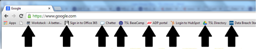
A favicon is the square logo that can be seen on the tabs in your web browser or on your bookmark bar.

They are usually small emblematic representations of a company or a product. A rectangle just won't fit here. Additionally, rectangles that are forced to take this box shape result in smashed-together words that are hard to read and – often times – unrecognizable.
Avatars are also replacing many text-based logos. In the Internet world, avatars are symbols that represents companies and their brands. For companies – like Twitter and Android – these avatars are their logos.

In terms of social media, there aren’t many sites that ask users for rectangle-shaped pictures to place in their avatar box.
LinkedIn's standard logo is the exception with 100x60 dimensions. However, keep in mind that long, rectangular logos still have to be cropped fit these dimensions.
Technically, a rectangle with an emblematic logo could work in these cases, but if you have a long company name – or even single line phrases or taglines – in your logo, then the text is going to take some squinting to read on most screens.
Here are some examples. Side note: these are actual size and may take a magnifying glass to read.

Overall, don’t scrap your rectangular, text-based logo.
It belongs in letter heads and other print-based collateral. Instead, think about creating variations of your logo to represent your brand so that you can match the right brand symbol to the medium that displays it. Remember to stay consistent. And don't be afraid to use your emblematic logo without text! There are, after all, plenty of other places on sites where your full company name will appear.
Here are some tips for optimizing your logo:
- Create high resolution versions and keep the master versions.
- If you have variations, maintain a similar theme that is tightly tied to your branding.
- Be sure to have a logo version with a transparent background so that you can work with both light and dark backgrounds.
- Don't shy away from an icon-based logo. Some of the best logos can stand alone from their company name.
- Create both a color and a black and white version of your logo.
- Keep it simple. Some of the best logos are comprised of just a few letters or shapes.
- Play with typography. A clever use of typography can double as an image or can appear as a sort of ‘hidden image,’ which gives you bonus points.
- Focus on using bolder lines, fonts, and shapes. When logos shrink down, fine lines or intricate details become lost, or (even worse) they may clutter your logo.
- Create your logo in the appropriate software so that it is optimized from the ground up (vector file from scratch [eps, ai]). Vector-based logos can be deconstructed, rearranged, and have their colors and fonts changed. They also can also be shrunk to the tiniest measurement or blown up large enough to cover a football field (or larger!!).
Looking for a new company logo? Want to work off of an existing design to give your old logo a more modern look and feel? Contact us and we'll put you in touch with our design team.